What is Crazy-Bunny?
A sports nutrition and clothing brand with a street look. Its catalogue has 15 products: nutrition (whey protein, creatine, pre-workout, Cream of Rice, SOS Pack, Beast Pack), T-shirts, a polo shirt, a zip jacket and accessories.
 Send an enquiry
SL
Send an enquiry
SL
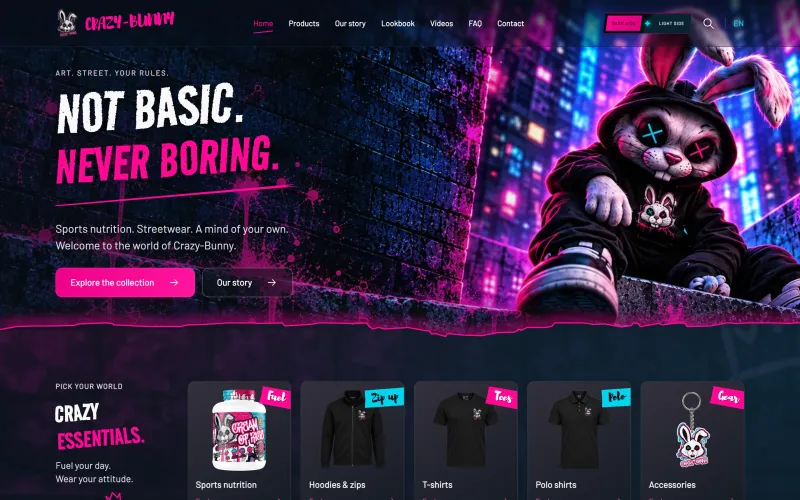
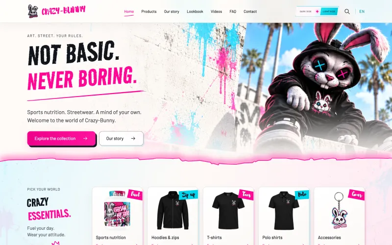
A website for a sports nutrition and streetwear brand with two complete looks: a neon city at night and a sunny concrete wall. Visitors switch between them with one click.
Related service: Website development
Crazy-Bunny sells sports nutrition and clothing with a street, graffiti look. Their slogan "Not basic. Never boring." was also the brief: a site that looks like every other protein store was off the table.
The brand wanted two sides. The dark one is the city at night under neon lights, the light one is the street by day with sun, palm trees and paint splashes. This is not a dark mode that simply inverts colours: each side has its own illustrations, background and character, and both have to stay readable and equally easy to use.
From day one the project was anything but boring. Every idea had two sides, every detail had to work by day and by night, and every animation had to bring the page to life without getting in the way. It took plenty of trying and polishing until the site was exactly like the brand: loud, bold and still easy to find your way around.
Goal: That visitors feel straight away they have entered the Crazy-Bunny world, pick their side and reach nutrition, clothing or accessories without searching.
We built two complete templates. The light theme is a separate layer of styles on top of the dark one, so every button, card and form exists in both versions. The "Dark Side / Light Side" switch sits in the header and works without JavaScript because the server handles it.
The home page, products, brand story and lookbook each have their own full-screen illustrated scene, with the same composition in a night and a day version. Each scene ends in a torn edge, and the page continues below it.
The illustrations, product photos and the brand's videos are tied into one world. Every scene, transition and movement continues the same story, from the first screen to the lookbook and the videos page.
Motion is part of the brand's character: products float gently and slide into place with a slight tilt as they appear, a coloured aura pulses behind them, a strip of text runs across the page, and after a newsletter sign-up a hopping rabbit says thanks in front of a burst of rays. Anyone with reduced motion turned on in their device settings gets a calmer version.
Dark Side and Light Side with separate illustrations and colours, not just inverted colours. The switch works without JavaScript.
Four main pages each have a full-screen scene in a night and a day version, with a torn edge at the bottom.
Motion gives the site its pulse: floating products with a pulsing aura, a running text strip and a hopping rabbit that says thanks after newsletter sign-up. It respects the reduced motion setting.
15 products: sports nutrition (from whey protein to the Beast Pack), clothing (T-shirts, polo, zip jacket) and accessories (shaker, punching bag, keyring).
When a visitor picks a clothing colour, the gallery shows only the photos of that colour and its description.
Separate pages for photos of the clothing in action and for the brand's video content.
Crazy-Bunny now has a site that cannot be mistaken for the catalogue of any other sports nutrition brand. Visitors choose whether they see the night or the day side, while the content and products stay the same and equally accessible.
For now the site is in English and works as a catalogue with the brand's story; products are not bought through an online cart on it.
More questions and the contact form on the enquiry page.
A sports nutrition and clothing brand with a street look. Its catalogue has 15 products: nutrition (whey protein, creatine, pre-workout, Cream of Rice, SOS Pack, Beast Pack), T-shirts, a polo shirt, a zip jacket and accessories.
There is a "Dark Side / Light Side" button in the header. Switching changes the colours and the illustrations of all main scenes. The server handles the switch, so it works even if JavaScript does not load.
A custom website with two complete themes, illustrated scenes in night and day versions, animation, a product catalogue with colour choice, a lookbook and a videos page. Website development
No. The site is a catalogue with the brand's story, without an online cart or payment.
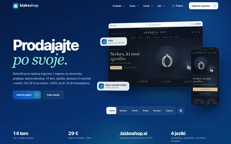
Our own product: a platform where a business opens an online store in a few steps, with its own domain, payments, delivery and one of 14 themes, for a monthly rental fee.
Read the case study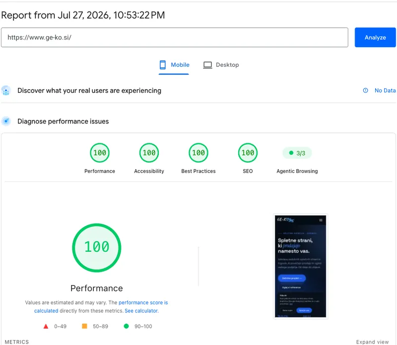
Our own site is the best proving ground: a rebuild that kept a domain registered back in 2014, scores 100/100/100/100 on Google's measurement and is ready for AI search.
Read the case study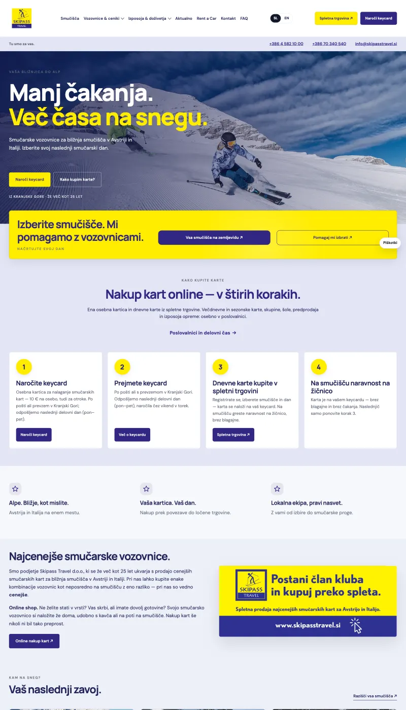
A redesigned bilingual site where skiers pick a resort, order a keycard and buy a pass without queuing at the ticket office.
Read the case studyWe'll build a site with your character and keep it fast to use and clear for visitors.
We reply within one working day
Mon–Fri, 8:00–16:00 (Slovenian time), Jesenice, SloveniaSlovenščina